Dark Mode Design: 15 Essential Dos and Don’ts for Better UI/UX
Dark Mode Design has become one of the most influential trends in modern UI/UX. From operating systems like iOS and Android to apps such as Twitter, YouTube, Slack, and Instagram, dark interfaces are everywhere. While dark mode offers sleek aesthetics, reduced eye strain, and potential battery savings, creating an effective dark theme requires much more than simply inverting colors.
If you’re a designer or product creator looking to implement or improve a dark theme, this comprehensive guide to dark mode design will walk you through the essential dos and don’ts to create visually pleasing, accessible, and user-friendly experiences.
Why Dark Mode Design Matters
Before diving into best practices, it’s important to understand why dark mode design has gained massive popularity:
- Visual Comfort: Reduces glare and eye strain in low-light environments.
- Battery Efficiency: OLED and AMOLED screens consume less power with darker pixels.
- Modern Aesthetics: Dark interfaces feel sleek, premium, and professional.
- Accessibility: Helps users with light sensitivity or visual impairments.
However, poorly executed dark mode UI can hurt usability and readability. Let’s explore what works—and what doesn’t.
Dark Mode Design Do: Use True Dark or Dark Gray Wisely
Using pure black (#000000) can save battery on OLED screens, but it can also create harsh contrast with text. Many successful dark mode designs use dark gray shades instead.
Best practice:
- Use dark gray backgrounds like #121212 or #1E1E1E
- Create depth using multiple dark tones
- Reserve pure black for high-impact sections only
Dark Mode Design Don’t: Simply Invert Your Light Theme
One of the biggest mistakes in dark mode design is directly inverting a light theme. Dark mode is not a mirror—it’s a reinterpretation.
Why inversion fails:
- Poor color harmony
- Uncomfortable contrast
- Reduced readability
Pro tip: Design dark mode as a standalone theme with adjusted hues, contrast, and brightness.
Dark Mode Design Do: Adjust Color Saturation and Brightness
Colors appear more vibrant on dark backgrounds. Without adjustment, they can feel overwhelming.
Suggested color strategy:
- Primary colors: 80–90% opacity
- Secondary elements: 60–70%
- Disabled states: 40% or lower
This approach keeps your dark mode UI design balanced and visually calm.
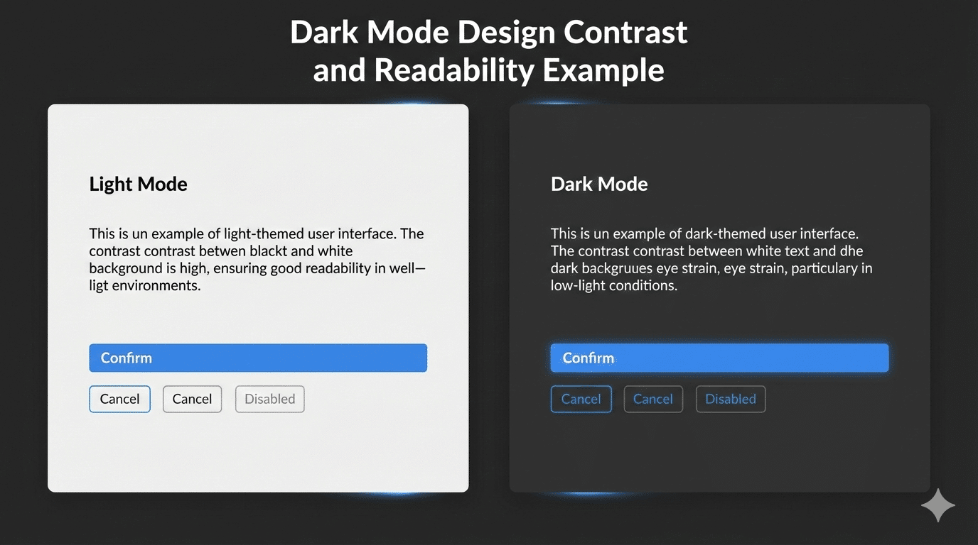
Dark Mode Design Don’t: Use Pure White Text
Pure white text (#FFFFFF) on a dark background creates extreme contrast, leading to eye fatigue.
Better text hierarchy for dark mode design:
- Headings: #FAFAFA
- Body text: #CCCCCC
- Secondary text: #999999
This improves readability while maintaining visual comfort.
Dark Mode Design Best Practices for Readability and Contrast
Accessibility is critical in dark mode design. The WCAG recommends:
- 4.5:1 contrast ratio for normal text
- 3:1 contrast ratio for large text
Helpful tools:
Dark Mode Design Don’t: Overuse Shadows or Blur
Heavy shadows and blur effects can make dark interfaces feel muddy.
Design tip:
- Use subtle borders
- Layer surfaces with color variation
- Apply minimal elevation cues
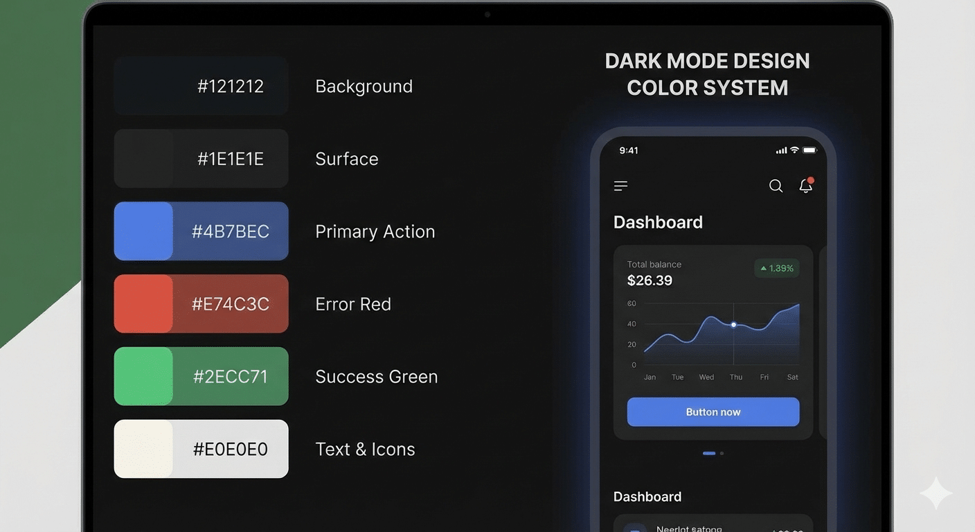
Dark Mode Design Do: Build a Dedicated Color System
A strong dark mode design uses a separate color system that still reflects your brand.
Example dark mode color system:
- Background: #121212
- Surface: #1E1E1E
- Text: #E0E0E0
- Accent: #82B1FF
- Error: #FF6B6B
Useful resources:
Dark Mode Design Don’t: Ignore Interactive States
Buttons, links, and inputs must remain clear in all states.
Ensure visibility for:
- Hover
- Active
- Focused
- Disabled
Clear feedback improves usability and trust.
Dark Mode Design Do: Test in Real Environments
Always test your dark mode design outside design tools:
- Low-light and bright conditions
- OLED and LCD screens
- Accessibility tools and screen readers
User feedback is invaluable for refining your design.
Dark Mode Design Don’t: Forget Branding Consistency
Dark mode should adapt your brand—not replace it.
Brand adaptation tips:
- Use darker brand-friendly tones
- Adjust logos for contrast
- Maintain consistent typography
Dark Mode Design Do: Offer an Easy Toggle
Users appreciate control. Always provide a simple way to switch modes.
UX best practices:
- Visible toggle in header or settings
- Remember user preference
- Support system-level dark mode detection
Bonus Tips for Dark Mode Design
- Gradients : Use darker gradients and avoid bright highlights.
- Typography: Slightly increase font size and line spacing.
- Cards & Containers: Use borders and elevation carefully.
Final Thoughts: Design Dark Mode with Purpose
Dark mode design is more than a visual trend—it’s about usability, accessibility, and comfort. When done right, dark themes reduce eye strain, improve engagement, and elevate your product’s experience.
Whether you’re designing a mobile app, website, or dashboard, follow these dark mode design best practices, test with real users, and iterate continuously. A thoughtfully designed dark mode can truly set your product apart.


